October 31, 2013

Aerin's Style

Aerin Lauder has been featured in many design magazines over the years and has recently released her line of furniture and fabrics. I use Kravet and Lee Jofa to source the majority of the fabric that I use so when her new line for Lee Jofa was released I was excited to see it. There are some real stellar fabrics but one thing I noticed was that they don't mix that well together. Some of her fabrics are traditional prints and some remind me of the 70's. A quick look at her overall style and I realized that her fabrics actually represent her taste perfectly. She seems to love an overall traditional  style mixed with some modern pieces. See what I mean below...

Traditional Built-ins and Drapes with Modern Desk

Traditional Wall Coverings with Modern Desk

Traditional Vingette

Traditional Formal Living Room

Modern Credenza and Art with Funky Lamp

Two Styles Juxtaposed

September 22, 2013

Moody Blues

Lately I've been drawn to blue. It reminds of the ocean...both calming and volatile at the same time. It can so soothing and peaceful and yet if you've ever been caught in huge wave you know how violent the ocean can be. In rooms I find that blue is mostly a relaxing color. It can be very energetic when used in it's most saturated state. Here are some images of blue in the more ocean-y - teal colorway.


Source Unknown

Katie Singer

Kendall Wilkenson

Kendall Wilkenson

Miles Redd

Palmer Weiss

Worth Interiors

August 18, 2013

Travel in Style


Interior design studio FG stijl's in Amsterdam created a lounge for those who charter private jets. As if travelling by private jet is so stressful that you need a exclusive lounge to relax in before your pilot tells you he's ready when you are! Needless to say the lounge is gorgeous and I would love to see it!  It's ultra luxurious materials of Onyx, mother of pearl and leather make for a glamorous yet masculine space. I love how they mixed traditional elements in a contemporary style. Orange and green earth tones compliment a blend of metals...copper, bronze, and steel.  Ready for take off!


May 28, 2013

Outdoor Drapes

Summer is almost here and it's time to start living outdoors. I wish that sunbathing wasn't terrible for your skin! But since it is...enjoying the outdoors in a protective cocoon like a cabana is a great way to get the best of both worlds. Outdoor spaces can look hard without plants and furniture to soften the space. Outdoor drapes can really add drama and movement to your outdoor environment. Here are some yards that make me want to grab a good book and lounge around...


April 26, 2013

Lovely Lavender

I was shopping for stone slabs a few weeks ago and came across a lavender and blue marble that I have never seen before. I took a photo of it but it's terrible! My clients really liked this stone and were considering it for their master bathroom. We ultimately decided that it was too much of a good thing and we would definitely use it for a smaller bathroom in their house.

This got me thinking about lavender...I haven't really used this color much. Most of the purple tones I have used run towards the plum and eggplant colors. I think because lavender is somewhat feminine I haven't had any clients that really wanted to go that direction.

Here are some lavender rooms that look fantastic. Could you live with lavender?


April 24, 2013

Poster Child

4 poster beds are great for adding drama and volume without bulk. If you have a bedroom with high ceilings a 4 poster bed can give the room interest and height. They are a terrific alternative to the massive amount of upholstered beds we are seeing so much of these days. The options for poster beds are immense. Consider wood, mirror, metal or a combination of upholstery and one of the aforementioned materials for a four poster bed. Which of these bedrooms would you love to have?


April 23, 2013

Tangerine Dreams

I would never say that orange is a favorite color of mine. Orange has always conjured up images of Tide laundry soap and syrupy soda. However, one look at my website, blog, and logo and clearly, I do like orange! Orange is a color that is life affirming, exciting and warm. It is an energetic color and looks great when paired with neutrals. Tan, cream, and white are wonderful background colors to let orange pop. The following rooms show how gorgeous orange be...no laundry soap or soda in sight!


April 19, 2013

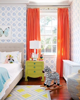
Creative Kids Rooms

There is nothing more fun than designing a kid's room. Creativity comes first followed up by function. Color and design can be used in heaping portions. I am not one to design children's room to grow with them...hey..I'm a designer...I'd rather redo the room with each changing phase! It's fun and exciting! Here are some children's spaces that inspire me.


Great mix of color!

Love the Map Wallcovering

Great Patterns

3-D Art

Bold Stripes, Texture, and Color

Love the Ceiling and Contrasting Wall