I love this Colorado home designed by Peter Dunham of Los Angeles. The wood paneling looks so old and rustic but without that stale feeling. It looks so fresh and modern and still looks like its been there forever. I adore the kitchen. That island!!! I also appreciate the use of lighter upholstery fabrics to balance the wood that is everywhere. What a great vacation home!
Brightly painted front doors add instant happiness to a house. They also announce to visitors exactly where to go. There are so many options and each one carries with it a different feeling. Soft shades come across more sophisticated and elegant while bright saturated colors feel more casual and fun. See for yourself...
Wintertime always brings me to light candles. I think the warm glow of candle light is incredibly soothing not to mention flattering. I do like scented candles the best, however, when it comes to dinnertime scented candles can disrupt the pleasant smells of cooking food. That is when tapers or unscented pillar candles are in order. Here are few unique and interesting candle holders that are sure be great conversation starters. These are available from 1stdibs.
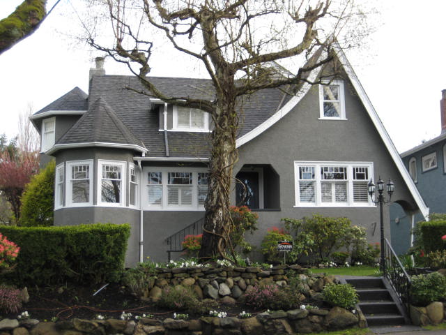
Exterior paint colors always seem be tough to figure out! I think it's because the light is always changing so drastically. I like to consult the major paint companies and see their popular colors and combinations to start. It's a great way to get a sense of what you like. Now that grey has become the go to neutral color of the decade I am seeing more and more grey houses. I think they look sharp! I love the pop that a grey house with white trim makes. Grey looks great on modern and traditional designs.
While watching a movie called Columbus Circle on Netflix this Christmas I noticed that some lamps and accessories in Selma Blair's apartment were Jonathan Adler's designs. While I am not generally a huge fan of his 60's mod look, he does make some beautiful lighting!! Here are some examples of his interiors that are nice and some of my favorite light fixtures.
This home is on the market for $57,500,000.00 in Santa Barbara, California. It has over 20,000 square feet of living space and 360 degree views. It's quite breathtaking and has rooms for formal living and casual living. I think the rooms speak for themselves but if the new buyer needs a designer...I am available!
Polka dots are fun and whimsical. Incorporating them into interior design can be tricky. Color and scale are very important when using polka dots. Large scale polka dots in primary colors look child-like and dramatic while smaller scale dots in subdued tones give a more sophisticated look. Of course you can mix and match these combinations and end up with child-like sophistication! Here are a few examples of polka dots that I love!